Sopron
Date : 2016
Category : általános

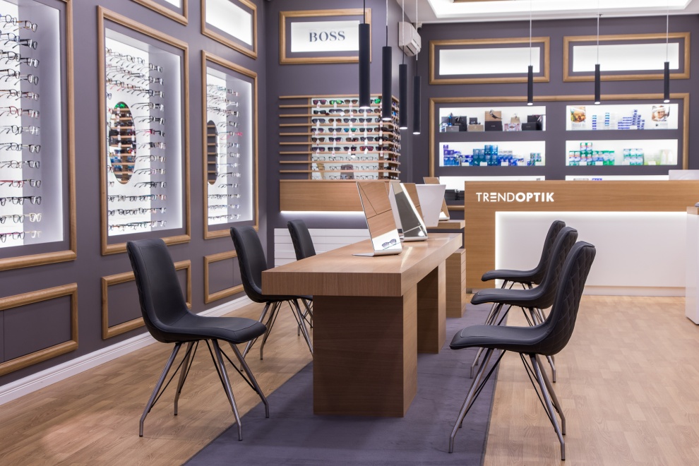
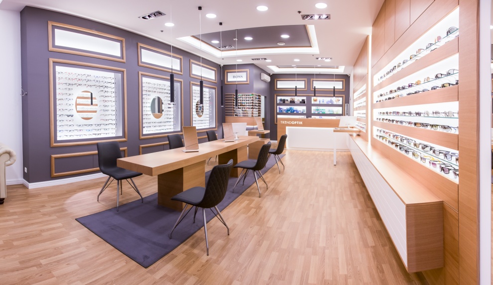
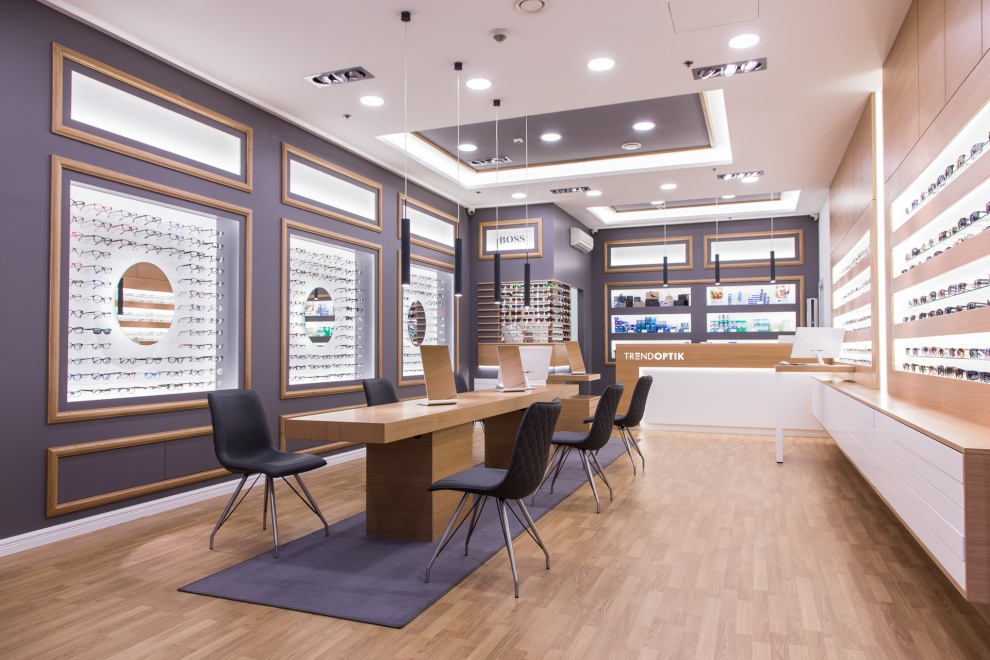
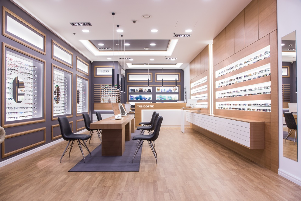
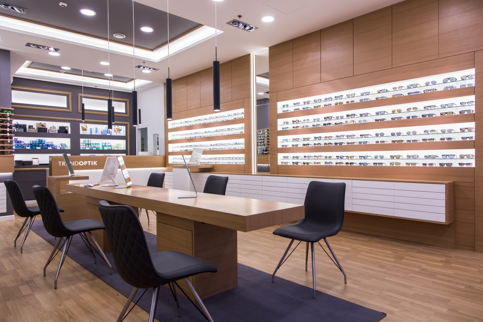
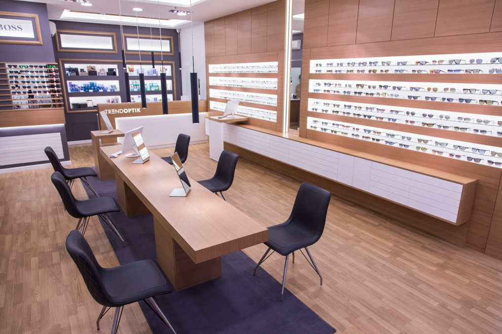
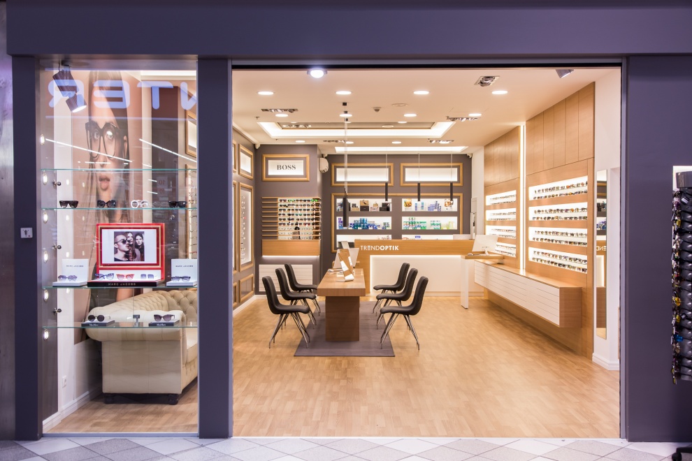
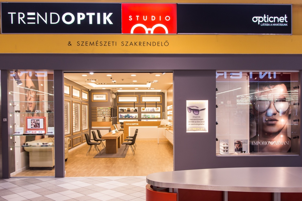
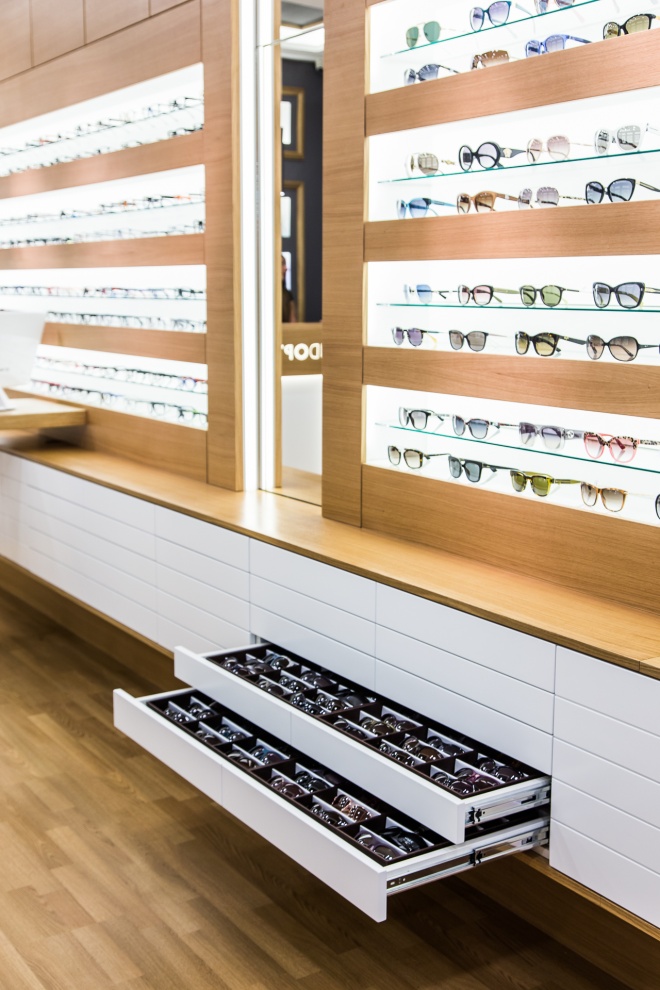
A design based on rectangles and presenting middle-class sophistication was needed. The appearance of the shop is determined by squares and right angles, which represent precision. The most perfect of all curves, a circle, is scarcely present in the shop; it is only there to Besides the mirrors, only chairs and tables bear some discreet curves. The colours are also modest: dark grey and oak determine the interior, and it goes without saying so does white. As part of the concept, the sales counter was placed at the back of the shop to enable the customers to explore the variety of goods. The self-service table occupying the space is composed of the same oak wood that the frames around the display holes are made of. These display holes contain glasses frames illuminated by bright light to attract the attention of visitors like a magnet. The massive legs of the table also function as cabinets with sufficient space to even hold a computer. The white walls of the units opposite with their horizontal arrangement direct one’s eyes up to the sales counter enhancing the sense of abundant space. The counter protrudes from the furniture with its white body, it resembles the onyx altar in the Benedictine Abby of Pannonhalma - with a little bit of exaggeration.


